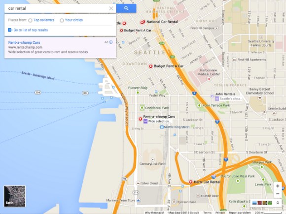
Google’s bound to pull back the curtain on some goodies at its annual I/O conference next week (though it’s being characteristically quiet about the whole thing), but could a redesigned version of Google Maps be one of them? That’s what the folks at the (completely unofficial) Google Operating System blog hint at — they’ve come into possession of a pair of screenshots that supposedly depict Google’s new approach to mapping, and if true they point to some serious modifications.
If true, then Google is ditching he traditional sidebar altogether. Instead, the company may be putting greater emphasis on the map itself and shifting pertinent information — think location data, photos, and Zagat reviews — to a series of cards that hover in the top left corner of the screen.
Oh, and the yellow streets are gone too. I’m just as bummed as you are.
As always, I’d recommend firmly grasping a grain of salt as you pore over the images, but they the visual advances seen in them seem just measured enough to give them some credence. The images depict a version of Google Maps that falls in line with some of the other design choices the folks at Mountain View have been running with lately.
Google’s been pushing those cards quite a bit lately — Google Now was the first service to run with the card metaphor, and the search giant recently revamped its Google Play Store Android app to put individual app and song listings into cards as well. We haven’t really seen those cards invade the desktop yet (unless you count those right-aligned boxes that Google’s Knowledge Graph results live in), but persistent rumors and leaks point to a desktop web version of Google Now that could go live any day now. Hell, even Google Glass uses what the company refers to as timeline cards to encapsulate and display information from Glass apps. All that said, it would hardly be a shock to see Google turning to Maps as the next service to get a card-centric facelift.
And hey, it’s not like Google has been all that great at keeping its secrets behind closed doors lately. Who could forget the completely unexpected Chromebook Pixel reveal that had journos and pundits scratching their heads back in February, not to mention the early Google Play Store redesign leak and the prematurely released video that touted Google Now for iOS that appeared just weeks later. This latest batch of screenshots may leave you with more questions than answers, but I suspect that all will be revealed before long.

Source: techcrunch.com
 10:05:00 AM
 Unknown


0 σχόλια:
Post a Comment