I dropped our Galaxy Note II review unit -graciously provided by our friends at Clove- back in the mail just a few days ago. We used it as the basis for a series of feature articles, several video comparisons, and our full review last week, and its departure is already giving me a case of Empty Nest syndrome. There’s a lot I miss -and some I don’t- about carrying the world’s newest, biggest, baddest phablet … but you’ll have to wait for the latest edition of Empty Nest to drop before you get to read all the saucy details.
In the meantime, the return to more conventional smartphones has made me keenly aware that, though Samsung bundles quite a few gimmicks that are more style than substance into its newest headliners, some of these features are really useful. Useful enough to miss when you’re suddenly deprived of them. We’ve already touched on some of these, but here, for your reading pleasure, are our selections for the top three features of the Samsung Galaxy Note II.
Ridiculously Powerful Multitasking
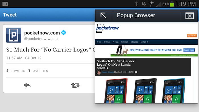
Surfing the feed in Twitter and come across a link that’s begging for a click? On any other smartphone, clicking on that glowing string of blue temptation clumsily dumps you out of the Twitter app and into your device’s browser, requiring you to sit there and watch as the phone loads the page. Not so on the Galaxy Note II, whose big display and powerful hardware offer enough canvas and horsepower to whip up a miniature browser in a pop-up window. Keep on scrolling and clicking away in your Twitter stream or Facebook feed while the page loads; when it’s there, read what you came for, then click the X to send Pop Up Browser on its merry way. Or, maximize the window (this requires a page reload) to see your webpage in full size.
If your multi-tasking tastes are more exotic, requiring simultaneous use of more than just a browser and another app, Multi Screen is your solution. It allows a handful of apps -even select third-party apps like Facebook and Twitter- to run side-by-side on the Galaxy Note II’s display, both of them in focus at the same time. This eliminates the need to, say, hop back and forth between Email and Maps looking up an address your boss sent you; Multi Screen allows both apps to run simultaneously.
Marvelous Memo-Making
Samsung took a big gamble in bringing back the venerable stylus in the form of the S Pen, and it paid off. We’ve had ourselves a little S Pen Lesson detailing all the functions and features of the little guy, but the one I found most useful in my time with the Galaxy Note II was the pop-up S Note action.
The execution is pretty simple: if you’re out on the town and someone wants to give you the name of a local bar, or a phone number, or an address, or anything you need to jot down in a hurry, the Galaxy Note II is your instant wingman. Pop out the device’s S Pen, press the button on its side, and give the screen a double-tap with the tip of the pen. No matter what app you’re in, a popover window containing a miniaturized version of S Note will appear, allowing you to jot down the salient bits of info that might otherwise have been lost to the haze of the night. Too bleary-eyed to write well? The eraser function is carried over from the full-size version of the app, as is the text-recognition option. When your note is complete, tap the check mark to save it and dismiss the pop up … or hit “x” to delete the memo once you realize that whatever this person is saying isn’t that critical after all.
Hot Hovering Action
Anyone can slap a stylus on a smartphone and call it a day. It takes real forethought and some serious hardware on the device side (in this case, a Wacom digitizer) to make it a worthwhile addition. Samsung has brought the S Pen fully into the latter category with the Note II, and expanded on a feature it partially introduced with the first Galaxy Note in the process: hover-cursor ability.
Bringing the S Pen close enough to the Galaxy Note II’s screen results in the software projecting a cursor onto the display at the location of the S Pen’s nib. This cursor can be used much like a mouse cursor on a desktop computer, to bring up preview windows on a video scrubber, activate drop-down menus on websites without clicking the underlying link, or open preview panes in apps like the Calendar and Gallery. The end result is a relationship with the interface that feels more like a full desktop experience than any other smartphone can offer. As we put it in the full review:
There’s
a sense of being fully invested in the device. You’re not
absentmindedly using it one-handed while half your focus is elsewhere;
you’re tapping, scrolling, and panning with both hands using a pen
that’s projecting a cursor on the display … It feels like, if you needed
to, you could get a whole lot done; much more so than on a more
conventional smartphone.
 2:12:00 PM
 valgeo


0 σχόλια:
Post a Comment